Maps Used To Be Cool - What Happened?
? Get NordVPN 2Y plan + 4 months free here: https://nordvpn.com/knowledge It’s risk-free with Nord’s 30-day money-back guarantee!
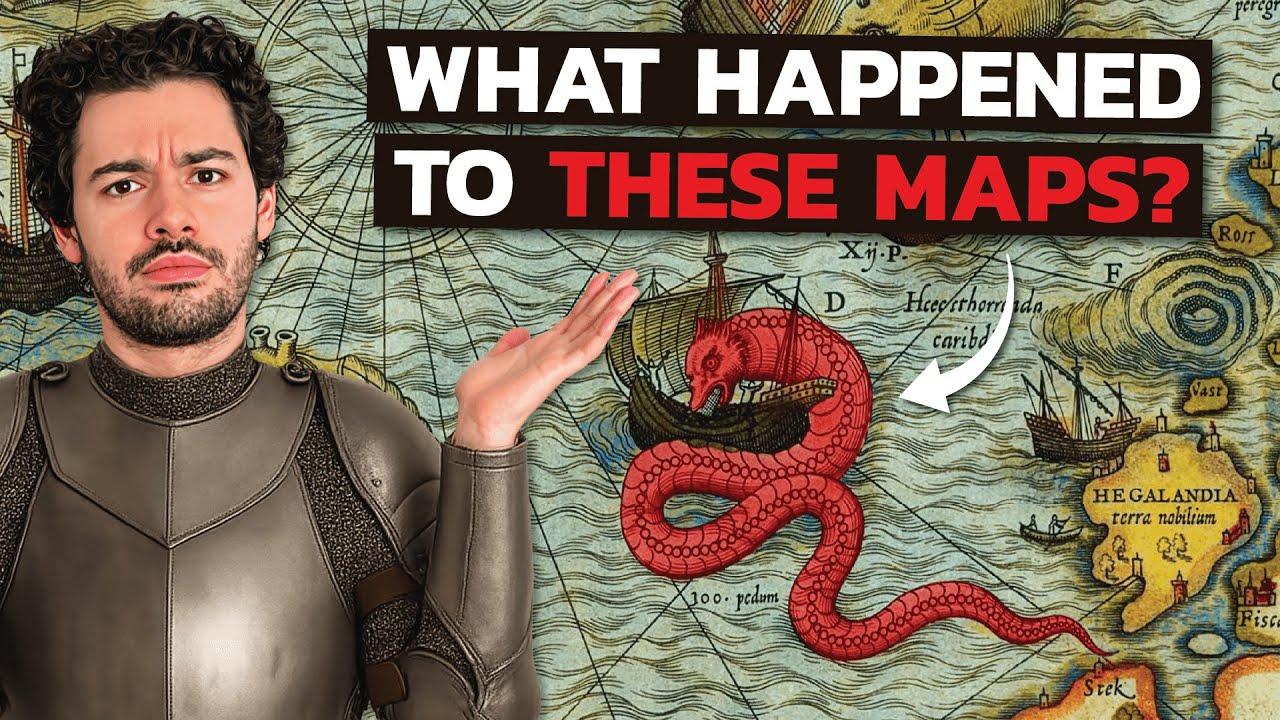
Have you ever noticed how modern maps (be it Google Maps or even printed atlases) prioritise function over beauty? In this video we explore why maps used to be works of art, filled with mythical sea creatures, kings, ships and architectural depictions; and how we ended up with flat minimalistic terrain views that are just kind of... boring? From the Tabula Peutingeriana to Piri Reis, Renaissance cartography, and the Mercator projection, we dive into 2,000+ years of map evolution and explain when, how and why aesthetics were replaced by precision and mass-production efficiency.
TIMESTAMPS:
00:00 Maps used to be cool
01:15 Tabula Peutingeriana
03:31 Tabula Rogeriana
05:05 Old City Maps (Piris dos Reis)
07.26 Why did maps become boring?
07:44 The oldest map in the world
08:14 Aneximander & Ptolomy's maps
09:47 NordVPN
11:21 Medieval maps
12:42 Age of Discovery
15:13 Renaissance maps
17:49 The printing press effect
20:03 Massification of maps
❤️ Become a member on Patreon & get your name in the credits + exclusive content! https://www.patreon.com/generalknowledge
Stay up to date on more content from me:
? Tiktok: https://www.tiktok.com/@general.knowledge.yt
? Twitter: https://twitter.com/GKonYoutube
?️ Instagram: https://www.instagram.com/genknowledge/
▶ Join the Discord Server: https://discord.com/invite/f4neAVWZfF
▶ Business Contact: gilfamc@gmail.com
#GeneralKnowledge

General Knowledge
I make videos about flags, countries, maps, history & geography in general!...